Tech for your business event, but Smoother
Planning an event can be overwhelming, but not with us.
About Us
Smooth AV is a Sydney-based audiovisual and event production company and our number one priority is making your event run so smoothly that your audience doesn’t even notice we’re there. We only hire experienced, professional and lovely technicians who will make sure your event runs smoothly. We focus on all the technical aspects of your special event, Visuals, Audio, Lighting.
Trusted by some lovely companies

Check out some of our case studies
Calling the Shots: Mastering Show Calling for Seamless Events (and Avoiding Disaster!)
Events with lots of cues don't just happen, the important onse have a "show caller" instructing everyone what to do, and exaclty when! In this blog I outline the basics of what make s agood show calle... ...more
Event Preparation
February 06, 2025•3 min read
5 Events Tips to inmprove your AV experience
Your relationship with your AV team can help your event go smoothly, here are some tips for makeing everyones lives easier, and everyones events smoother. ...more
Event Preparation
February 07, 2023•5 min read
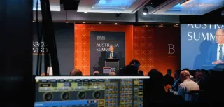
AV Events @ Sheraton
A breakdown of Smooth AV's Event at the Sheriton Grand in Sydney for the Barrons 100 Conference ...more
Event Brake down
October 24, 2022•2 min read
Post-Covid AV For Live Events: What’s Changed?
The world of AV has changed, will it ever go back? ...more
Common
May 02, 2022•4 min read
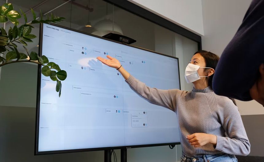
What’s the difference between my Zoom meeting and a professional stream?
Have you ever felt that your audience is disengaged in your online meeting? Do you often feel like you’re talking to yourself? Do you find yourself feeling anxious that one or all of the things you pl... ...more
Remote Streaming Tips
September 15, 2021•6 min read

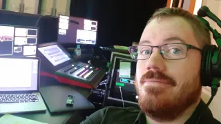
How to share your screen like a pro
Lots of people still struggle with this one, so here is a guide of how to share you screen properly ...more
Remote Streaming Tips
September 04, 2021•3 min read
FAQS
What types of events do you specialize in planning?
We specialize in planning a wide range of events, including weddings, corporate gatherings, social celebrations, and more. Our experienced team is equipped to tailor our services to meet your specific needs and vision. Whether it's an intimate family gathering or a grand corporate gala, we have the expertise to make your event exceptional.
But Bill from accounting is a DJ and he says "we can use cheaper speakers"
Firstly, can we have Bills number, we are always looking for more DJs.
Secondly Bill has unlikely DJed in the same room that you are hosting your conference in and the speakers he would use I'm sure are great at being really loud, but are probably not suited for other applications, like spoken word.
Everyone is an expert at speakers or powerpoints or just computers in general, but we are professionals at using this equipment for this particular purpose. We know what we are doing, and again, if we need a DJ, we'll hit up Bill.
Is the equipment to buy or to hire?
Smooth AV is a full service Event Tech provider, our service includes installing the equipment, operating the equipment and removing the equipment after the event, so it is a hire. Afterwards it will be like we were never even there, if not for the great memories.
SmoothAV is a specialist audiovisual events company, based in Sydney and providing audiovisual services throughout Australia. We look after on-site AV and event livestreams for event management companies and in-house event managers, making all technical aspects of your events run smoothly.
We provide AV for:
Conferences and AGMs
Award nights and gala dinners
Company meetings and town halls
Product launches
Roadshows